Subtitles

Standard

While we finish up the audio mixing with Matt this week, we decided to make a change to the look of our subtitles in Autumn Gem. Up until today, we’ve been using Final Cut’s standard Text generator to create our subtitles. Here’s a screenshot of what our subtitles used to look like:
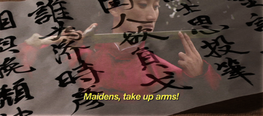
autumn-gem-subtitles-yellow

This afternoon, I began switching over to using the Outline Text generator. This has a number of benefits, chief among them the ability to add a stroke around each character, which greatly improves readability. In addition, we’ve changed the font style from italic to plain, which reduce jaggies when displaying the film on lower-resolution monitors or on DVD. Here’s what our subtitles look like now:
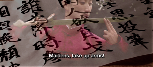
autumn-gem-subtitles-white

I’ve been planning to make this change for many months, but I’ve been procrastinating until now, knowing that it would take me about nine hours to change every text clip in the entire film. Unfortunately, there’s no quick and easy way to batch convert from one text generator to another. I did find some shortcuts that helped speed up the process:

  1. Create an outline text generator with your default settings for font style, size, and stroke width
  2. Place the outline text on your timeline and set the duration to be exactly the length of the text you are replacing
  3. Copy the text clip that you are replacing (Command-C)
  4. Paste Attributes onto the new outline text clip (Option-V)
  5. Double-click on the original text clip
  6. Copy the text under the control tab
  7. Double-click on the new text clip
  8. Paste the new text under the control tab
  9. Repeat with the rest of your text clips

One annoying thing is that the placement controls are different between the two text generators. For instance, setting a center position of (0, 345) for an Outline Text clip does not line up in the same place as setting (0, 345) with a standard Text clip. This means I’ve had to manually position a number of text clips, a time-consuming process that I really don’t want to visit again!

So, the decision to go from straight text to outline text, while simple, requires lots of time, patience, and verification. In the end, though, it’s the right move, as our subtitles are much more readable now than before.

For those type-inclined, we used the classic font Helvetica Neue for main subtitle font. Hoefler Text was used as our serif title font, and ST Kaiti was used when displaying Chinese characters.
Advertisement

Final Cut Tips for Documentary Filmmakers

Standard

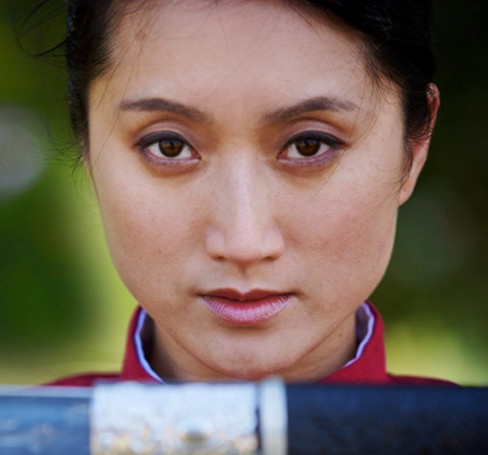
Li Jing demonstrates her form for the Women's Army

Rae and I have learned quite a bit about using Final Cut to create our documentary, Autumn Gem. Here are some tips that will save you a lot of time when putting together your film.

  1. Backup regularly
  2. Run Final Cut Pro on a clean system
  3. Get out of GOP and embrace ProRes 422
  4. Use whole integers with Ken Burns Effect
  5. Gaussian blur
  6. Avoid JPEGs
  7. Set subtitle opacity to 90%
  8. Using the Outline Text generator for your subtitles
  9. Watch your gamma
  10. View your footage on a broadcast monitor

Continue reading

Picture Lock and Compressor

Standard

compressor-300x279

Here’s a screenshot from the Mac OS X Activity Monitor showing all eight cores on our Mac Pro working hard to encode Autumn Gem into a DVD. Our documentary is about 60 minutes long, and it takes roughly two hours to perform a 2-pass MPEG-2 encode.

As of today, we’ve created five different cuts of the film, each one leaner and more representative of the final cut. We’ll soon be calling picture lock on the film, which means no more edits. At that point, the audio will be sent for final mixing and I’ll complete my color grading. We still need to ADR a few scenes, which we plan to record over the next few weeks.

Then, we’ll move onto the next phase, which is figuring out how (and how much it will cost) to get the documentary transferred onto a format suitable for exhibition. Last night, we watched the latest cut on our HDTV, with video piped in from my MacBook Pro. The footage looked fantastic, and I really hope that we can get the picture to look like this on DVD and on HDCAM and DigiBeta (the preferred film festival exhibition formats these days). With the last few DVDs that we’ve produced, I’ve noticed that the colors are more washed out when compared to the Final Cut version. As a result, I’m experimenting with different settings in Compressor, raising the bitrate and dialing in some gamma correction. Eventually, the right combination of settings will come to me!

I’m pretty happy that we’ve been able to stay close to our original project schedule. Six months of pre-production, six months of production, and another six months of post-production. Next year, we’ll be shifting our focus more towards marketing, business development, and screenings. We can’t wait to start screening the film to the general public!

White Balance and Color Grading

Standard

During the filming of Autumn Gem, we used Phoxle SpectraSnap White Balance Filter 1 to set a custom white balance for each scene. I’ve used many white balance products in the past, including ExpoDisc, WhiBal, and gray cards, and I’ve found the SpectraSnap to be one of the better products out there. Its ability to fit a wide variety of lenses, including the two Sony videocameras we used to film the documentary, was key. I also appreciated the fact that it is a shoot-through white balance filter; I’ve found the accuracy of those to be higher than reflected light WB filters.

In the film, however, we’re not always looking to have a neutral color tone throughout our scenes. Getting neutral-looking footage, however, makes it easier to color correct — or color grade, as it’s called in the film industry — afterwards. I’ve been using a combination of Final Cut’s Three-Way Color Corrector filter and Apple’s Color application to perform various color grading tasks.

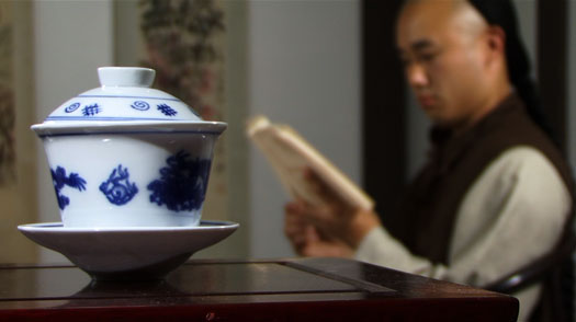
Here are screenshots of a before and after scene from Autumn Gem. The photo on the below is what was recorded by the the camera. As you can see, there is still a slight cast to the photo, even when using the SpectraSnap. I suspect that’s because the lights we used to light the background versus the foreground were different.

The original look of the serving tea scene.

The original look of the serving tea scene.

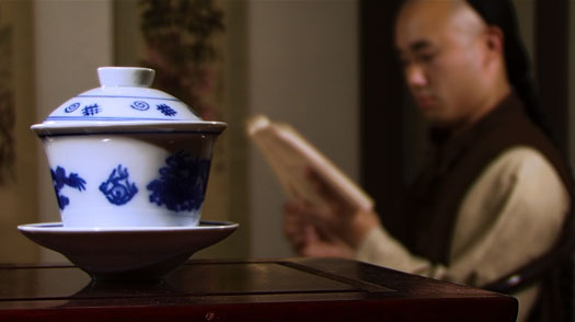
The next photo is the same scene that was corrected using Color. I set up a number of Secondary Rooms to apply color corrections to only specific parts of the scene such as the walls or Qiu Jin’s outfit.

The serving tea scene that has been color corrected using Apple Color.

The serving tea scene that has been color corrected using Apple Color.

Once we have picture lock on the film, I’ll continue to color grade certain scenes from the film. Not all scenes require such work, and for those, the built-in Three-Way Color Corrector in Final Cut does as admirable job. For more complex scenes, however, Color is a powerful tool for getting the look that we want out of the film.


1 Phoxle is run by Chris Pedersen, a friend of mine whom I know from my Camera Owners of the Bay Area user group meetings.

Wushu ala Final Cut

Standard

This afternoon, we edited a scene from our filming of the Chinese Women’s Army at Tilden Park in Berkeley. Li Jing, who plays Qiu Jin in the documentary, is running through a hand form.

The timeline from a wushu scene from the film

Nine takes were used to construct this scene. One take was a wide shot which we use to start the sequence. Mixed throughout are eight closeup shots detailing the action as Li Jing goes from one move to the next. Add in a little wind sound, and we’ve got ourselves a nice 34-second clip!

There’s a saying that a film is really created in the editing room. After having spent several months living in Final Cut, Rae and I certainly agree with that statement!